The key is not “a keychain with a logo.” It is a design people want to carry, touch, and show, with branding that feels intentional rather than forced.
What makes a metal keychain memorable in the first place?
A memorable keychain earns daily use, which creates repeated exposure without ads. The most effective metal keychain feel substantial in-hand, look premium, and solve a tiny problem, like keeping keys organized or making them easy to find.
They also keep the brand readable at a glance. If the logo is hard to spot, too small, or visually noisy, the recall effect drops fast.
Which metal finishes make a brand feel more premium?
Brushed stainless steel, matte nickel, gunmetal, and black PVD coatings tend to read as modern and high-end. They photograph well, resist fingerprints better than mirror-polish, and make engraved marks more legible.
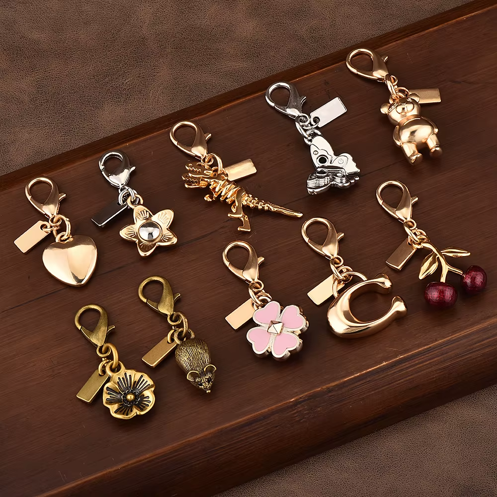
Gold-tone plating can work, but it is easier to make it look cheap if the tone is too yellow or the edges wear quickly. A safer approach is satin gold or antique brass when the brand leans classic.
How does weight and thickness influence brand perception?
Heavier keychains feel valuable, and that “value signal” transfers to the brand. A thin keychain may still look fine, but it can feel like a giveaway, which weakens the premium association.
For strong recall, many brands choose a thickness that does not flex, with beveled edges or a slight radius so it feels comfortable in pockets. If it annoys them to carry, it will not stay on their keys.
What logo treatments stay readable after months of use?
Laser engraving and deep etching hold up best over time because they do not rely on surface color. They still look sharp after friction, drops, and daily handling.
Enamel fill can be highly memorable if the color palette is controlled and the borders are thick enough to protect the fill. Printed logos are the riskiest on metal because wear and scratches can quickly reduce clarity.
Which shapes and silhouettes help people remember the brand faster?
Simple, iconic silhouettes create faster recognition than complex outlines. A shape that echoes the brand’s core idea, like a shield for security or a bolt for speed, becomes a visual shortcut in the mind.
Many successful designs avoid tiny cutouts and overly intricate edges. Cleaner shapes also reduce manufacturing defects, which helps the final product look consistent across batches.
How can brands use dual-sided designs without looking cluttered?
Dual-sided designs work best when each side has a clear job. One side can carry the logo, while the other adds a useful detail like a QR code, tagline, coordinates, or a simple pattern tied to the brand identity.
Clutter happens when both sides compete for attention. If everything is important, nothing is remembered. A two-sided approach should still feel minimal and intentional.
What functional add-ons increase daily use and recall?
Function increases carry rate, and carry rate increases recall. Useful add-ons include bottle openers, mini screwdrivers, NFC tags, or a detachable quick-release clip for valet keys or gym lockers.
The best add-on matches the audience. For example, a bottle opener fits hospitality and events, while a quick-release suits property management, car brands, and coworking spaces.
How do texture and tactility strengthen brand association?
Texture creates a “feel memory,” not just a visual one. Knurling, micro-etch patterns, raised borders, or recessed logo fields make the keychain distinct in-hand, which helps people recognize it without looking.
Tactile differentiation is also a subtle way to signal quality. When a keychain feels designed, not generic, it strengthens the link between the object and the brand behind it.
Which color accents work best on metal keychains?
Color should support recognition, not overwhelm it. A single enamel accent in the brand’s primary color is often enough, especially if the base finish is neutral like gunmetal or brushed steel.
High-contrast combinations improve legibility, like white on black, or bright enamel inside a deep-etched boundary. Too many colors can make the piece look like a souvenir rather than a brand object.
How can packaging and presentation boost recall even more?
Packaging can turn a small item into a “kept” item. A slim magnetic box, a recycled kraft sleeve with clean typography, or a simple foam insert makes the keychain feel gift-like and worth keeping.
It also creates a second branding moment. If the packaging includes a short message about the brand promise, it frames how they should interpret the item, which improves recall beyond just the logo.
What are the safest design rules to avoid a cheap, forgettable result?
The safest approach is restraint: one strong finish, one clear logo treatment, and a shape that feels intentional. Brands should avoid thin metal, sharp edges, tiny unreadable marks, and overly complex art that blurs at small sizes.
If they want maximum brand recall, they should choose a design people are proud to carry. When the object feels premium and useful, the brand becomes easier to remember for the right reasons.
FAQs (Frequently Asked Questions)
What makes a metal keychain memorable and effective for brand recall?
A memorable metal keychain earns daily use, creating repeated exposure without ads. Effective designs feel substantial in-hand, look premium, solve small problems like organizing keys, and keep the brand logo readable at a glance to maximize recall.
Which metal finishes convey a premium brand image on keychains?
Brushed stainless steel, matte nickel, gunmetal, and black PVD coatings are perceived as modern and high-end. They resist fingerprints better than mirror-polish finishes and enhance engraved mark legibility. Satin gold or antique brass are safer gold-tone options for classic brands.
How do weight and thickness influence the perception of a branded metal keychain?
Heavier keychains signal value, transferring that premium feeling to the brand. A thickness that prevents flexing with beveled edges ensures comfort in pockets. Thin or flimsy keychains may feel like giveaways, weakening the premium association and reducing carry rate.
What logo treatments maintain readability on metal keychains after months of use?
Laser engraving and deep etching hold up best over time since they don’t rely on surface color and resist wear from friction and handling. Enamel fills can be memorable if colors are controlled and borders protect the fill. Printed logos are least durable due to scratches.
How can dual-sided metal keychain designs avoid looking cluttered while enhancing brand impact?
Dual-sided designs work best when each side has a clear purpose—one side for the logo and the other for useful details like QR codes or taglines. Avoid having both sides compete for attention; a minimal, intentional approach ensures strong brand recall without clutter.
What functional add-ons increase daily use and brand recall for metal keychains?
Functional add-ons like bottle openers, mini screwdrivers, NFC tags, or detachable quick-release clips boost carry rate by adding utility. Choosing add-ons that match the audience—for example, bottle openers for hospitality events or quick-release clips for property management—increases daily use and strengthens brand recall.
See Also: Custom keyrings vs standard keychains: what’s the difference?
0 Comments